Ducks vs decorated sheds
Sunday, July 3, 2016


When I started designing for the web you couldn’t do a lot with html. Everything was just plain text, images and hyperlinks. You could only use a handful of fonts. Maybe an animated GIF here and there. And if you wanted to create a layout, you had to use standard tables, or image maps. But then came CSS, Javascript and Flash. And with that came the possibility to design fresh and crazy layouts. We could use audio and video and all the fonts in the world. We were unstoppable!
When I started designing for the web you couldn’t do a lot with html. Everything was just plain text, images and hyperlinks. You could only use a handful of fonts. Maybe an animated GIF here and there. And if you wanted to create a layout, you had to use standard tables, or image maps. But then came CSS, Javascript and Flash. And with that came the possibility to design fresh and crazy layouts. We could use audio and video and all the fonts in the world. We were unstoppable!
Then the smartphone came. We started having access to the internet everywhere at any time. It also meant the death of Flash. Screens started getting smaller. Everything had to become “responsive”. We started using frameworks for code and design. We created layouts that start with a big hero image with a white text overlay and a single centered text column below it. Simple and sufficient.
Every website looks the same.
But have we taken it too far? Have we oversimplified web design to the point that it lost its voice? Maybe we have. A lot of websites today are the same single column of content, with a text column on the left and an image on the right. Or the other way around. Then maybe three columns of USP’s with icons. And maybe if somebody is really trying to be original, a background video. These one-pagers are basically just a bunch of sections (or chapters) on top of one another. But — again — they are simple and sufficient.
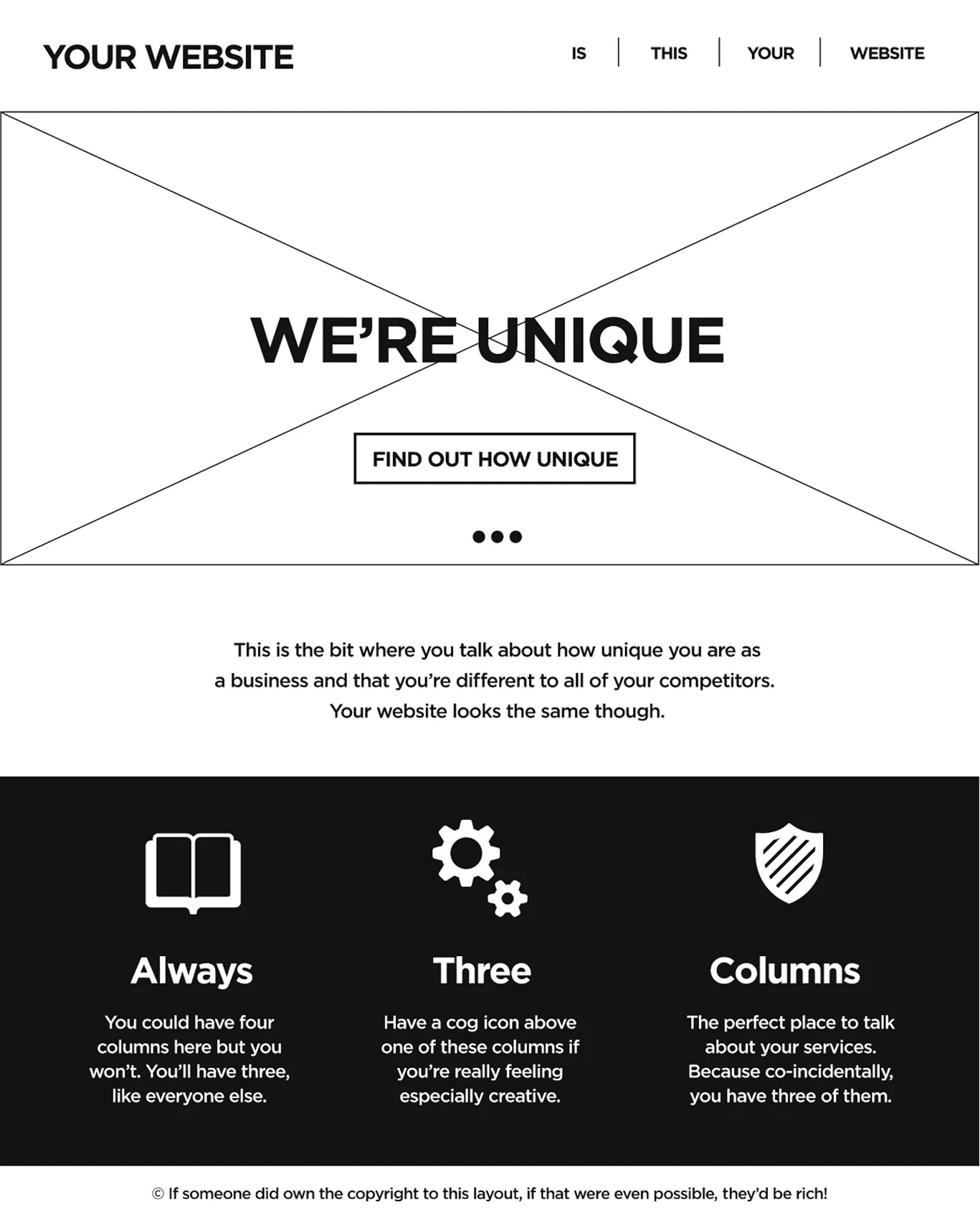
By Dave Ellis
Patterns are there for a reason
We’ve been using digital user interfaces for many years and a ton of layouts and design patterns have emerged, like the magnifying glass for Search or the (in)famous Hamburger icon to indicate Menu. Simplicity plays a really big role in this, and that’s part of the responsibility of being a designer: solving problems by making things easier. I think certain brands or clients are best served with a pre-fab template. Perhaps because it makes sense, from a financial standpoint or because it just suits their goals best.
Not just a webdesign problem
Designers have been struggling with this long before webdesign. I recently came across an article in Offscreen Magazine. In it Aaron Mentele wrote that in architecture there are two types of buildings: “ducks” and “decorated sheds”. (I later learned this was first brought up by Robert Venturi in his book Learning from Las Vegas) A “duck” is a building that doesn’t need signage to explain what sort of building it is. It was named after an actual duck-shaped building in Long Island that was used to sell, you guessed it: ducks.
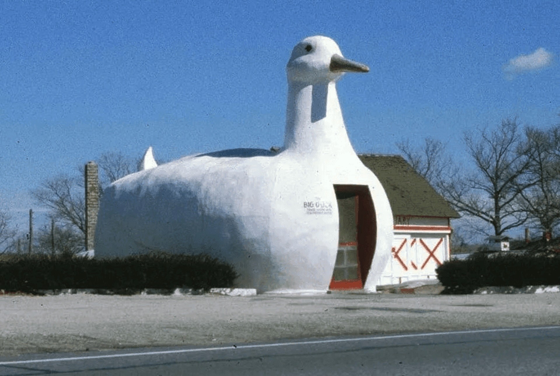
The Big Duck
And then there are the “decorated sheds”. The generic buildings, only identifiable by their signage. These buildings are all around us: offices, shops, restaurants. Put a logo on a glass and concrete shape and you’re done. Wouldn’t a city be much more interesting if it had more unique buildings? It might even function better, because the purpose of the buildings would be more apparent.
Not all is lost
Of course some websites and apps do look interesting. Sites like the FWA and Awwwards have been gathering these gems for years. New technology is constantly making us rethink our design patterns. Take a look at the Apple watch interface for example. It uses circles and zooming to create a new style of navigation. And what about VR or AR? Those techniques force us to think beyond the boxy layouts.
Learning from print design
Let’s take a look at print design for a minute. Open up a magazine like Esquire, Vogue or The Great Discontent and you’ll see the love. The way the design, typography, copywriting and photography work together to elevate the content: that’s love. Love for design and love for its content.
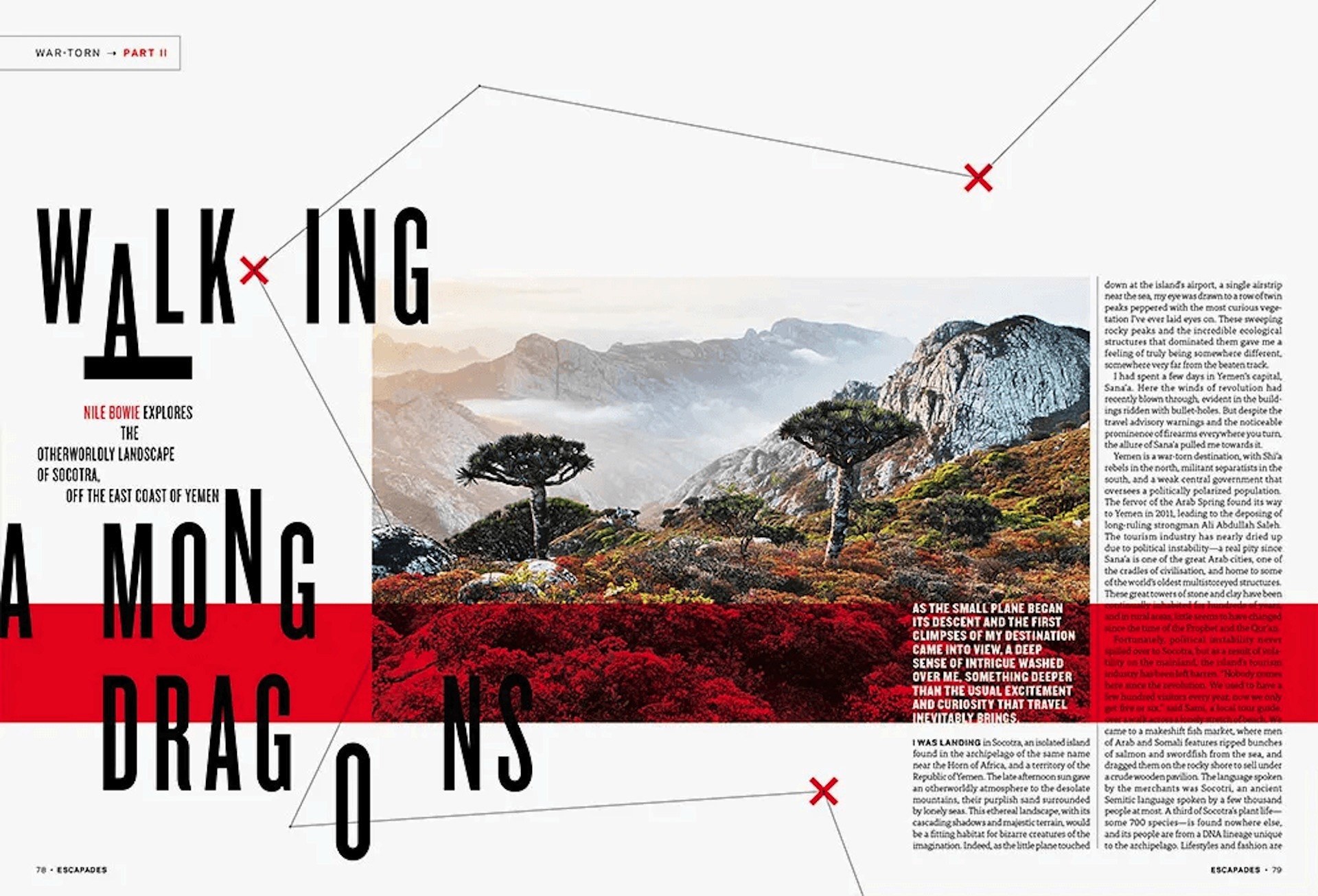
Editorial Design for Escapades Magazine by Matt Chase.
Of course the web is not the same as print. The web is so much more. It’s interactive, lives on multiple screens and has to take data transfer into consideration. Some websites do have great design, but why do we see so little of it? Is it because of the CMS? Maybe. Is it because there’s a limited budget? Probably. But I think we shouldn’t use this as an excuse to only create decorated sheds. We as designers have the responsibility to find solutions within those restrictions. If we believe a “duck” will help our clients reach their goals, we should go out and make those ducks.
Let’s try harder
I don’t think all is lost. I just think we should try harder. Perhaps we should point certain customers to “design machines” like Squarespace or Wix. That should leave us with more time to focus on creating original and innovative solutions. Maybe if you’re not in a position to make those decisions, you could create new and exciting design experiments as a side project.
I think that’s the beauty of the web: it empowers creators to make anything they want. So let’s put in the time and effort and start creating some ducks!
Then the smartphone came. We started having access to the internet everywhere at any time. It also meant the death of Flash. Screens started getting smaller. Everything had to become “responsive”. We started using frameworks for code and design. We created layouts that start with a big hero image with a white text overlay and a single centered text column below it. Simple and sufficient.
Every website looks the same.
But have we taken it too far? Have we oversimplified web design to the point that it lost its voice? Maybe we have. A lot of websites today are the same single column of content, with a text column on the left and an image on the right. Or the other way around. Then maybe three columns of USP’s with icons. And maybe if somebody is really trying to be original, a background video. These one-pagers are basically just a bunch of sections (or chapters) on top of one another. But — again — they are simple and sufficient.

By Dave Ellis
Patterns are there for a reason
We’ve been using digital user interfaces for many years and a ton of layouts and design patterns have emerged, like the magnifying glass for Search or the (in)famous Hamburger icon to indicate Menu. Simplicity plays a really big role in this, and that’s part of the responsibility of being a designer: solving problems by making things easier. I think certain brands or clients are best served with a pre-fab template. Perhaps because it makes sense, from a financial standpoint or because it just suits their goals best.
Not just a webdesign problem
Designers have been struggling with this long before webdesign. I recently came across an article in Offscreen Magazine. In it Aaron Mentele wrote that in architecture there are two types of buildings: “ducks” and “decorated sheds”. (I later learned this was first brought up by Robert Venturi in his book Learning from Las Vegas) A “duck” is a building that doesn’t need signage to explain what sort of building it is. It was named after an actual duck-shaped building in Long Island that was used to sell, you guessed it: ducks.

The Big Duck
And then there are the “decorated sheds”. The generic buildings, only identifiable by their signage. These buildings are all around us: offices, shops, restaurants. Put a logo on a glass and concrete shape and you’re done. Wouldn’t a city be much more interesting if it had more unique buildings? It might even function better, because the purpose of the buildings would be more apparent.
Not all is lost
Of course some websites and apps do look interesting. Sites like the FWA and Awwwards have been gathering these gems for years. New technology is constantly making us rethink our design patterns. Take a look at the Apple watch interface for example. It uses circles and zooming to create a new style of navigation. And what about VR or AR? Those techniques force us to think beyond the boxy layouts.
Learning from print design
Let’s take a look at print design for a minute. Open up a magazine like Esquire, Vogue or The Great Discontent and you’ll see the love. The way the design, typography, copywriting and photography work together to elevate the content: that’s love. Love for design and love for its content.

Editorial Design for Escapades Magazine by Matt Chase.
Of course the web is not the same as print. The web is so much more. It’s interactive, lives on multiple screens and has to take data transfer into consideration. Some websites do have great design, but why do we see so little of it? Is it because of the CMS? Maybe. Is it because there’s a limited budget? Probably. But I think we shouldn’t use this as an excuse to only create decorated sheds. We as designers have the responsibility to find solutions within those restrictions. If we believe a “duck” will help our clients reach their goals, we should go out and make those ducks.
Let’s try harder
I don’t think all is lost. I just think we should try harder. Perhaps we should point certain customers to “design machines” like Squarespace or Wix. That should leave us with more time to focus on creating original and innovative solutions. Maybe if you’re not in a position to make those decisions, you could create new and exciting design experiments as a side project.
I think that’s the beauty of the web: it empowers creators to make anything they want. So let’s put in the time and effort and start creating some ducks!