Little Big Details in Typography
Tuesday, July 2, 2024


As designers, I believe it’s our responsibility to pay attention to details. As Charles Eames said, “The details are not the details. They make the design.” This is especially true in typography, where small changes can have a big impact on the overall look and feel of a design.
As designers, I believe it’s our responsibility to pay attention to details. As Charles Eames said, “The details are not the details. They make the design.” This is especially true in typography, where small changes can have a big impact on the overall look and feel of a design.
Font selection, alignment, and hierarchy are well known to most designers, but here are a few other ”little big details” that I use in my work.
Straight versus Curly Quotes
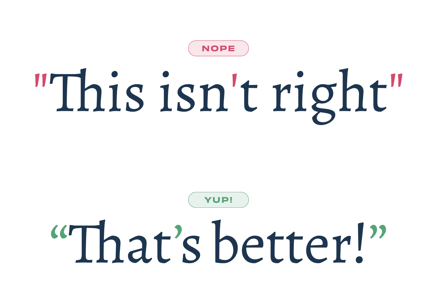
Example of (in)correct use of quotes and an apostrophe
This is one the details that I see all the time: using "straight quotes" instead of “curly quotes”. It probably has to do with the combination of keyboards (that don’t have these glyphs on them) and software (that doesn’t replace them), but you’re a designer, so you should care about these details. So here are a few tips on how to use them correctly:
When writing, use text-editing software that automatically replaces straight quotes with curly ones. It’s supported in Figma and you can also see it in Google Docs or Microsoft Word.
To learn the keyboard shortcuts, you can see them here (and learn a lot more).
The symbol for multiplications
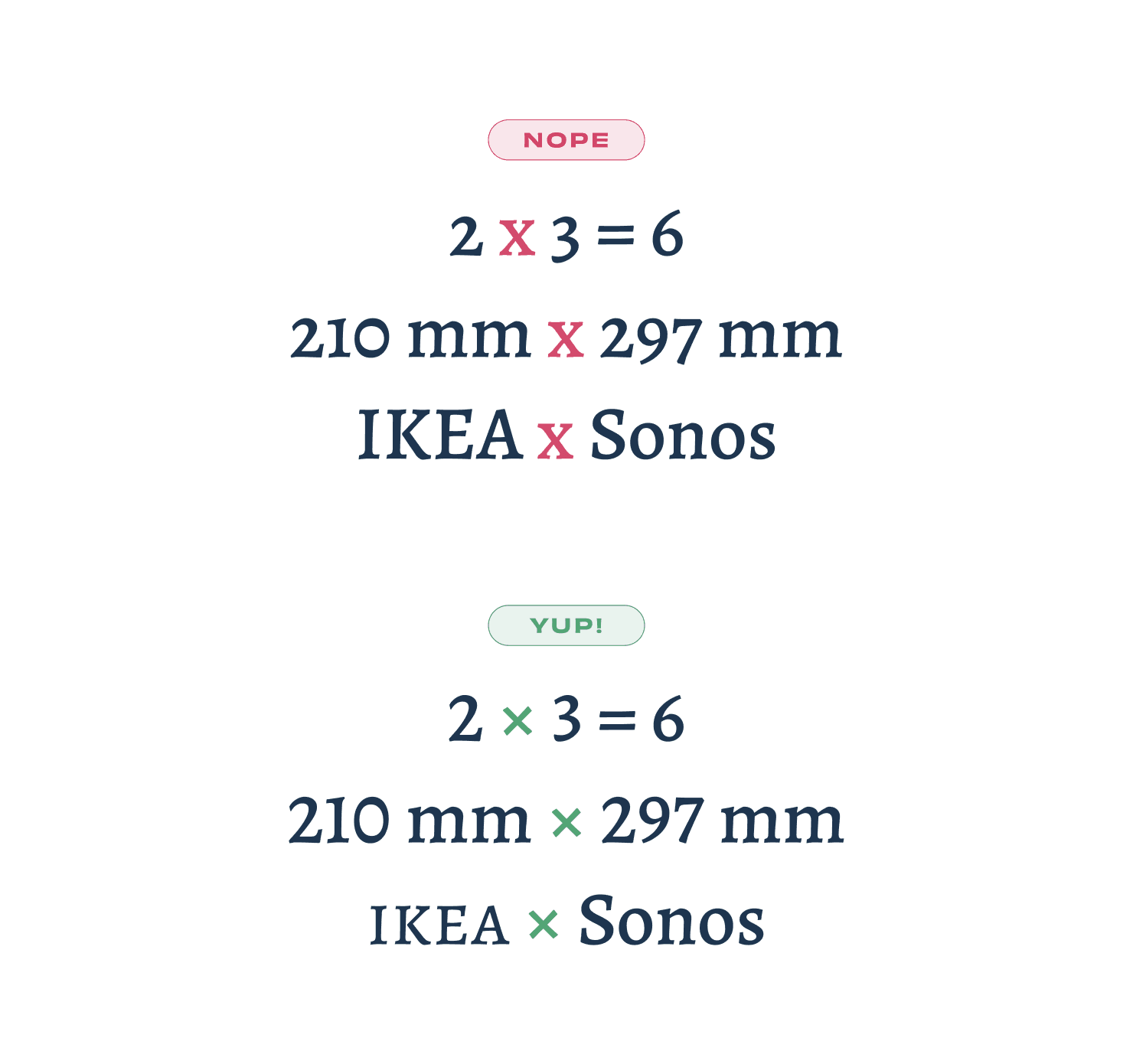
Example of the (in)correct use of the multiplication symbol
This is a bit more tricky to use, but when I see it done correctly, it always puts a smile on my face. The symbol for multiplication, or times, is a mathematical symbol: ×. It’s not a regular x, but a symmetrical cross that’s not available on a standard keyboard. You should use it for multiplications, dimensions and when you want to indicate a collaboration or ”versus” between two words. I usually copy-paste it from copychar.cc.
See more on Wikipedia.
Hanging punctuation
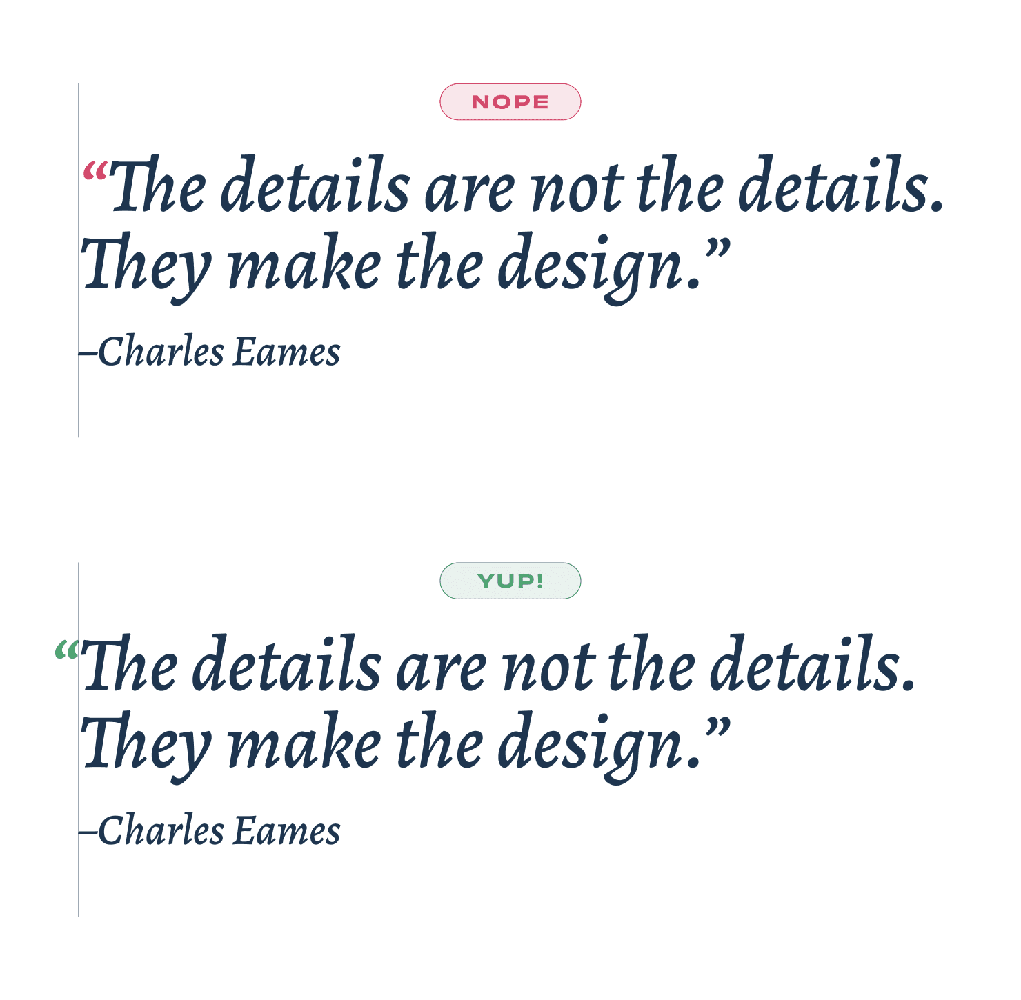
Example of (in)correct hanging punctuation
Now that you know how use the right quote signs, let’s talk about the design of quotes in a layout. Most of the times, depending on the typeface or look you’re going for, aligning the letters of a quote is more pleasing to the eye. Luckily you can now choose “hanging punctuation” in Figma (and in CSS) to automatically have the curly quote hang outside the container, making the letters aligned.
More about this on Wikipedia.
Using Primes for Feet and Inches
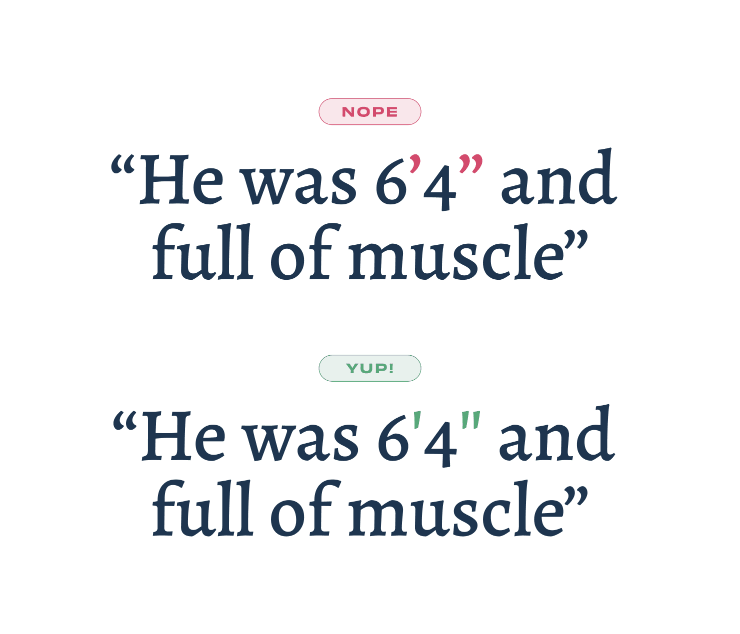
Example of (in)correct use of primes for feet-inches
You’ll probably not use this often if you’re not from the U.S. but, the correct way of representing feet (ft) and inches (in) is by using prime symbols.
More info on Wikipedia (including a triple prime ‴ and quadruple prime ⁗)
Use primes for coordinates
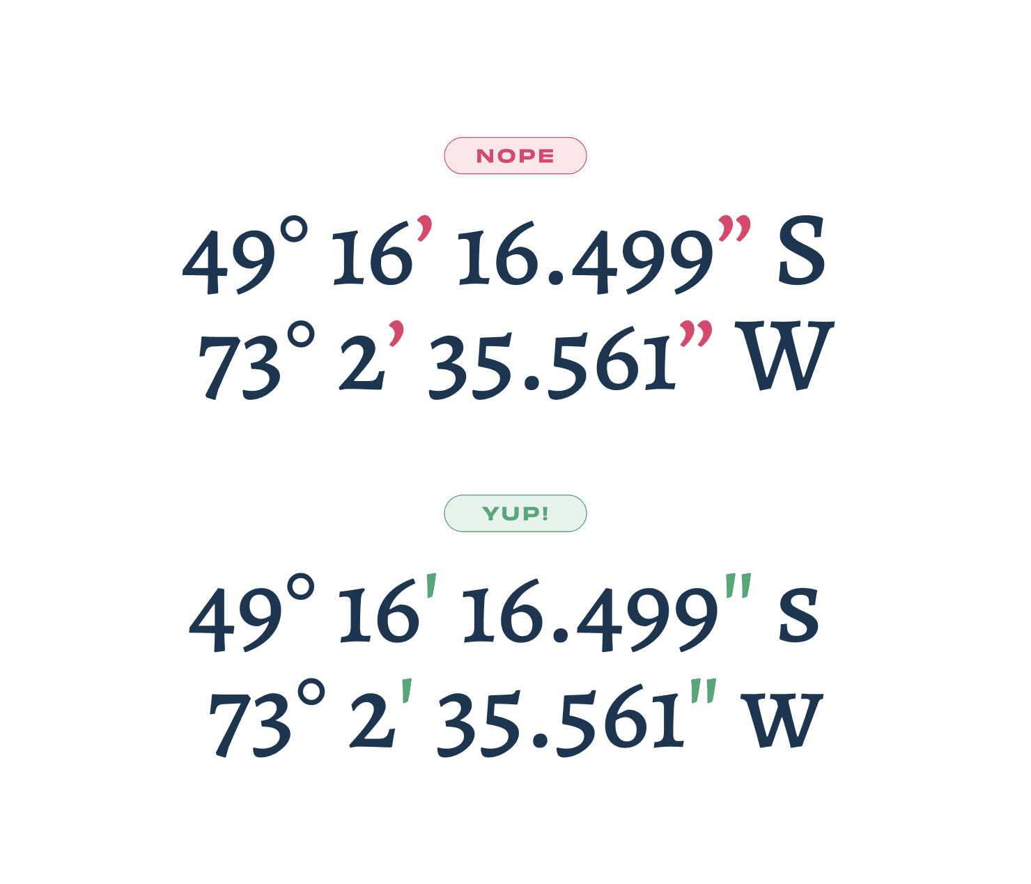
Example of (in)correct use of primes for coordinates
Talking about Primes: you should also use them as abbreviations for minute and second of latitude and longitude. And fwiw, you can copy the degrees symbol (°) as well from copychar.cc.
Tabular Figures
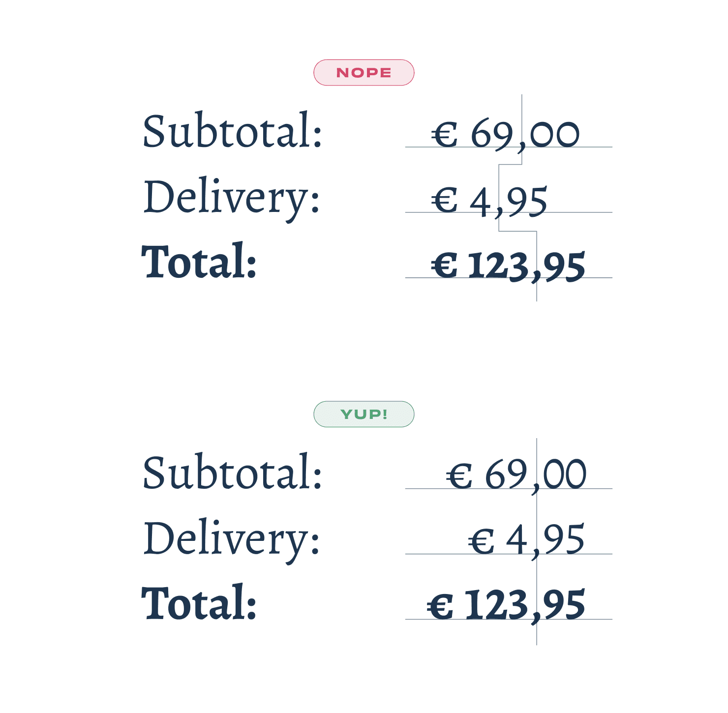
Example of (in)correct lining and tabular figures
Professional typefaces might include tabular numerals, numerals that are specifically designed for use in tables. They take up the same horizontal space so that they can be vertically aligned. This comes in handy when designing for price lists and invoices and a bonus tip: you should right align the numerals, so it’s easier to scan.
Much more about this on Google Fonts Knowledge.
Font selection, alignment, and hierarchy are well known to most designers, but here are a few other ”little big details” that I use in my work.
Straight versus Curly Quotes

Example of (in)correct use of quotes and an apostrophe
This is one the details that I see all the time: using "straight quotes" instead of “curly quotes”. It probably has to do with the combination of keyboards (that don’t have these glyphs on them) and software (that doesn’t replace them), but you’re a designer, so you should care about these details. So here are a few tips on how to use them correctly:
When writing, use text-editing software that automatically replaces straight quotes with curly ones. It’s supported in Figma and you can also see it in Google Docs or Microsoft Word.
To learn the keyboard shortcuts, you can see them here (and learn a lot more).
The symbol for multiplications

Example of the (in)correct use of the multiplication symbol
This is a bit more tricky to use, but when I see it done correctly, it always puts a smile on my face. The symbol for multiplication, or times, is a mathematical symbol: ×. It’s not a regular x, but a symmetrical cross that’s not available on a standard keyboard. You should use it for multiplications, dimensions and when you want to indicate a collaboration or ”versus” between two words. I usually copy-paste it from copychar.cc.
See more on Wikipedia.
Hanging punctuation

Example of (in)correct hanging punctuation
Now that you know how use the right quote signs, let’s talk about the design of quotes in a layout. Most of the times, depending on the typeface or look you’re going for, aligning the letters of a quote is more pleasing to the eye. Luckily you can now choose “hanging punctuation” in Figma (and in CSS) to automatically have the curly quote hang outside the container, making the letters aligned.
More about this on Wikipedia.
Using Primes for Feet and Inches

Example of (in)correct use of primes for feet-inches
You’ll probably not use this often if you’re not from the U.S. but, the correct way of representing feet (ft) and inches (in) is by using prime symbols.
More info on Wikipedia (including a triple prime ‴ and quadruple prime ⁗)
Use primes for coordinates

Example of (in)correct use of primes for coordinates
Talking about Primes: you should also use them as abbreviations for minute and second of latitude and longitude. And fwiw, you can copy the degrees symbol (°) as well from copychar.cc.
Tabular Figures

Example of (in)correct lining and tabular figures
Professional typefaces might include tabular numerals, numerals that are specifically designed for use in tables. They take up the same horizontal space so that they can be vertically aligned. This comes in handy when designing for price lists and invoices and a bonus tip: you should right align the numerals, so it’s easier to scan.
Much more about this on Google Fonts Knowledge.
“
By paying attention to these little big details, you can create designs that are both beautiful and functional.”
If you’re interested in even more details, here’s more to learn from:
Hope this was helpful!
If you’re interested in even more details, here’s more to learn from:
Hope this was helpful!